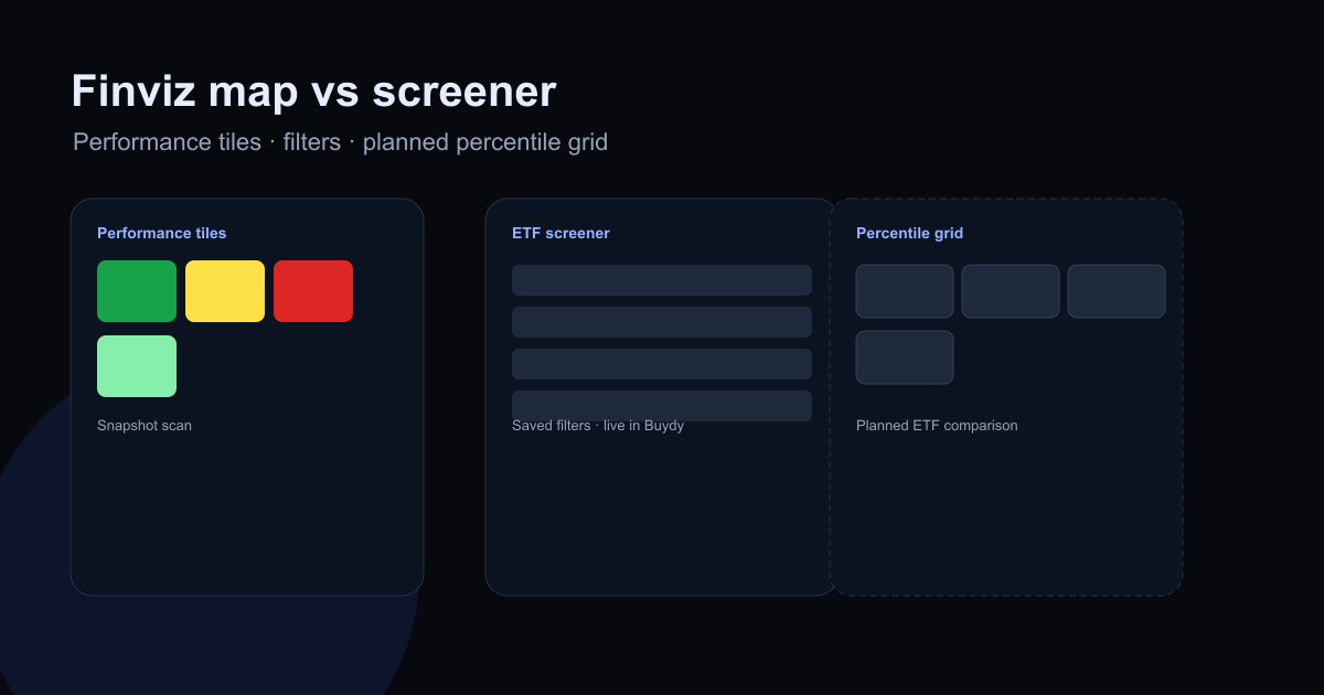
Searchers often land on Finviz ETF heat map pages when they want a fast visual scan of fund performance. That is a valid starting point. It is not the same problem as building a repeatable ETF research workflow with fees, liquidity, holdings, and exposure compared every week.
This article compares three surfaces honestly:
- Finviz-style performance maps (snapshot visualization).
- ETF screeners (filter and sort tables).
- Percentile ETF heat map comparison (Buydy live workflow for US-listed funds).
None of these are recommendation engines. Each answers a different question.
What Finviz-style ETF heat maps do well
Finviz and similar tools popularized tile maps where fund squares show category groupings and color encodes recent performance. Tile size may reflect assets or another scale variable.
Strengths:
- Fast macro scan across many ETFs.
- Immediate visual context for what led or lagged in a window.
- Low setup for casual monitoring.
Limits:
- Performance color dominates attention; fees and holdings sit elsewhere.
- Short windows overweight recent regimes.
- Harder to run the same comparison next week with saved rules and notes.
Use Finviz-style maps when you want a market snapshot, not when you need a documented fund selection memo.
What an ETF screener does well
An ETF screener applies filters and sorts to a universe: expense ratio ceilings, AUM floors, yield bands, asset class, and more. Output is a table you can revisit.
Strengths:
- Mandate-aligned filtering (income, core equity, bonds).
- Repeatable runs when filters persist.
- Raw fields visible for side-by-side comparison.
Limits:
- Wide tables still require manual normalization across peer groups.
- Sorting one column at a time hides multi-metric tradeoffs.
Buydy's live ETF screener workflow targets this layer: stable universes, saved filters, and honest data gaps.
Where a percentile ETF heat map fits
Buydy's live ETF heat map combines screener shortlists with side-by-side relative context: display percentiles vs label peer sets, raw values for verification, blank cells when data is insufficient.
That sits between:
- Finviz tiles (performance-first snapshot), and
- Screener tables (filter-first lists).
It supports questions like: "Among US dividend ETFs, which names combine acceptable fees, liquidity, and yield relative to peers?" without treating one return color as the answer.
Read the educational pillar what is an ETF heat map and the ETF heat map feature page.
Side-by-side comparison
| Question |
Finviz-style map |
ETF screener |
Buydy ETF heat map |
| Primary output |
Colored performance tiles |
Filtered sortable table |
Multi-metric comparison grid |
| Best for |
Quick visual scan |
Building and refreshing shortlists |
Ranking finalists across metrics |
| Fees / holdings |
Secondary |
Visible as columns |
Visible alongside percentiles |
| Repeatability |
Snapshot-oriented |
Strong with saved filters |
Strong when peer set is stable |
| Buydy status |
External tool |
Live |
Live |
A combined workflow many investors use
- Snapshot (optional): Finviz or index dashboards for weekly context.
- Screen: ETF screener to match mandate constraints.
- Compare: how to compare ETFs checklist on two or three finalists.
- Equity drill-down: stock heat map on top holdings when single-name risk matters. See how to use a stock heat map.
- Macro frame: global index monitoring.
This avoids two traps: pretty tiles without fund structure, and long screener lists without priority.
Is Buydy a "Finviz alternative"?
Partially, with different emphasis. Buydy is built for repeatable research workflows: screener persistence, stock percentile heat maps, live ETF heat map comparison, indexes, and digests in one membership. It is not a Finviz clone and does not offer Finviz-style ETF performance tiles.
If you need a free performance map for a quick scan, Finviz may remain useful. If you need weekly fund comparison discipline, start with the screener and comparison guides inside Buydy. For dedicated Finviz ETF heatmap alternative searches, see Finviz ETF heat map alternatives.
FAQ
What is the Finviz ETF heat map?
It is a visual map of ETFs where layout and color emphasize performance and scale in a snapshot view. It is popular for scanning what moved, not for full fund due diligence alone.
Finviz vs ETF screener: which first?
Use a screener when you know your mandate filters. Use a performance map when you want a quick visual scan of market leadership. Most serious workflows use both at different stages.
Does Buydy replace Finviz?
Not directly. Buydy focuses on persistent screening, percentile stock heat maps, and live ETF heat map comparison rather than free performance tile maps.
Where should I start in Buydy?
ETF screener workflows, ETF heat map, how to compare ETFs, and pricing.
Research summaries, not investment advice.