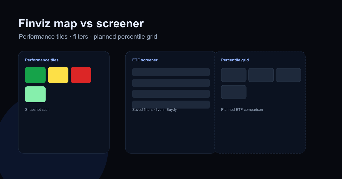
What are good Finviz ETF heat map alternatives? It depends what you are trying to learn. Finviz-style maps answer "what moved this week?" A screener answers "who passes my filters?" A percentile comparison grid answers "among these finalists, who looks strong or weak across several fund metrics at once?"
Those are different jobs. Mixing them produces confident fund picks with weak evidence.
This article maps Finviz ETF heatmap alternatives honestly: when Finviz is enough, when you need a screener or comparison workflow, and where Buydy fits without pretending to be a tile-map clone.
At a glance: pick the surface for your question
| If you need to… |
Start here |
| Scan weekly performance color across many ETFs |
Finviz-style performance map (external) |
| Filter US-listed funds by mandate (cost, AUM, yield, label) |
ETF screener |
| Rank two to six finalists within the same label peer group |
ETF heat map |
| Compare underlying holdings concentration |
Stock heat map on top names |
None of these tell you what to buy. Each helps you prioritize research and write down why a fund made your shortlist.
What the Finviz ETF heat map does well
Finviz popularized tile maps where fund squares sit in category groupings and color encodes recent performance. Tile size may reflect assets or another scale variable.
That format is excellent for a macro snapshot:
- You see leadership and laggards quickly across sectors and styles.
- Setup is minimal when you already use Finviz for stocks.
- The visual scan matches how many investors first notice rotation.
It is weaker for fund selection because performance color alone does not show expense ratio, typical spreads, holdings overlap, or index methodology. Two ETFs with similar green tiles can differ on distribution policy, tax efficiency, and cap weighting.
Use Finviz when you want context on what moved, not when you need a documented comparison memo for two or three finalists.
For tool-type differences, read Finviz ETF heat map vs ETF screener. For the full ETF heat map workflow, see what is an ETF heat map.
When you outgrow snapshot tiles
Investors usually search for Finviz ETF heat map alternatives when the same question keeps coming back every month:
- "Which of these three dividend ETFs is actually cheaper for peers?" Absolute expense ratio hides label context.
- "Did anything change since last week's screen?" Snapshot maps do not preserve filters, notes, or a stable shortlist.
- "Am I double-counting US large cap?" Holdings overlap matters; tile color does not show it.
At that point you need repeatable filters plus side-by-side peer ranks, not another performance scan.
Buydy workflow: screener, then heat map
Buydy is not a Finviz clone. It does not ship performance tile maps. The live alternative is a mandate-first loop for US-listed ETFs:
- Define the job in one line (core equity, dividend income, investment-grade bonds, sector tilt).
- Filter in the ETF screener: labels, expense ratio, AUM, yield, and other available fields.
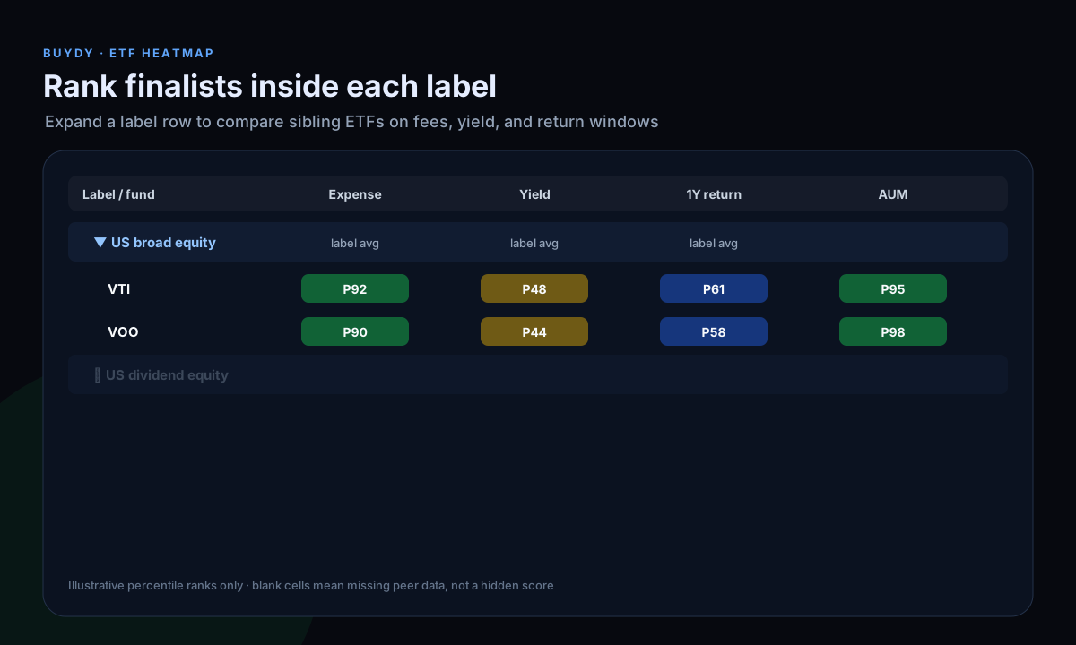
- Rank finalists in the ETF heat map: expand the label row, read display percentiles within that peer group, verify raw values.
- Run the checklist in how to compare ETFs before you read the prospectus.
Example: VTI, VOO, and SCHD can all look "fine" on a performance map while serving different mandates. The screener narrows by label and cost; the heat map compares sibling funds on fees, liquidity, yield, and return windows together. Neither step picks a winner for you.
If single-name concentration matters, open the stock heat map on top holdings after the fund-level pass. See how to use a stock heat map for filters and export.
Other options investors use (and where they stop)
Broker fund screeners fit when you already trade on that platform and only need basic filters. Peer context and export history are usually thin.
Issuer or ETF Database factsheets fit when you are down to one ticker and need the official document. They are painful for comparing six finalists in one view.
Spreadsheets fit when you control every column and refresh cadence. They go stale fast when the source is a one-time CSV export.
Stock heat maps on holdings fit when the ETF question becomes "how concentrated am I in ten names?" Remember ETFs are funds: use fund-level ranks first, then equity context on holdings.
Buydy is built for investors who want screener persistence, ETF and stock percentile grids, and index context in one membership, not because it replaces every free map on the web.
Finviz vs Buydy: fair comparison
| Aspect |
Finviz ETF map |
Buydy ETF workflow |
| Primary output |
Performance-colored tiles |
Screener table + percentile comparison grid |
| Best for |
Quick visual scan |
Repeatable fund shortlist reviews |
| Fees / liquidity |
Secondary |
Visible in screener and heat map columns |
| Underlying equities |
Not the focus |
Stock heat map for holdings drill-down |
| Access |
Free snapshot tool |
Full workspace free for 12 months after registration (details) |
Many investors keep Finviz for snapshots and use Buydy for weekly discipline on the shortlist they actually trade. That is a reasonable split, not a failure to pick one tool.
FAQ
What is the best Finviz ETF heat map alternative?
There is no universal best. Finviz remains useful for snapshot performance context. When you need repeatable fund comparison on fees, liquidity, yield, and return windows within label peers, use an ETF screener plus a percentile heat map workflow. Buydy combines both for US-listed funds.
Does Buydy replace Finviz?
Not directly. Buydy does not replicate performance tile maps. It replaces the part of the process where you compare ETF finalists every week with saved filters, peer percentiles, and honest blank cells when data is insufficient.
Is there a free Finviz ETF heatmap alternative?
Finviz itself is free for basic maps. Every new Buydy account gets 12 months of full access free (access details) for the ETF screener, ETF heat map, stock heat map, global indexes, and research digests. No credit card is required.
Finviz ETF heat map vs ETF screener: which first?
Use a screener when you know your mandate filters. Use a performance map when you want a quick leadership scan. Most serious workflows use both at different stages. See Finviz ETF heat map vs ETF screener for a side-by-side breakdown.
How is this different from the ETF heat map pillar?
The pillar explains what an ETF heat map is and how to read percentiles. This article answers what to use instead of Finviz when snapshot tiles are not enough. Start with what is an ETF heat map, then return here if you arrived from a Finviz search.
Is this investment advice?
No. These are research workflow notes. Portfolio decisions remain yours.
Next steps in Buydy
Research summaries, not investment advice.