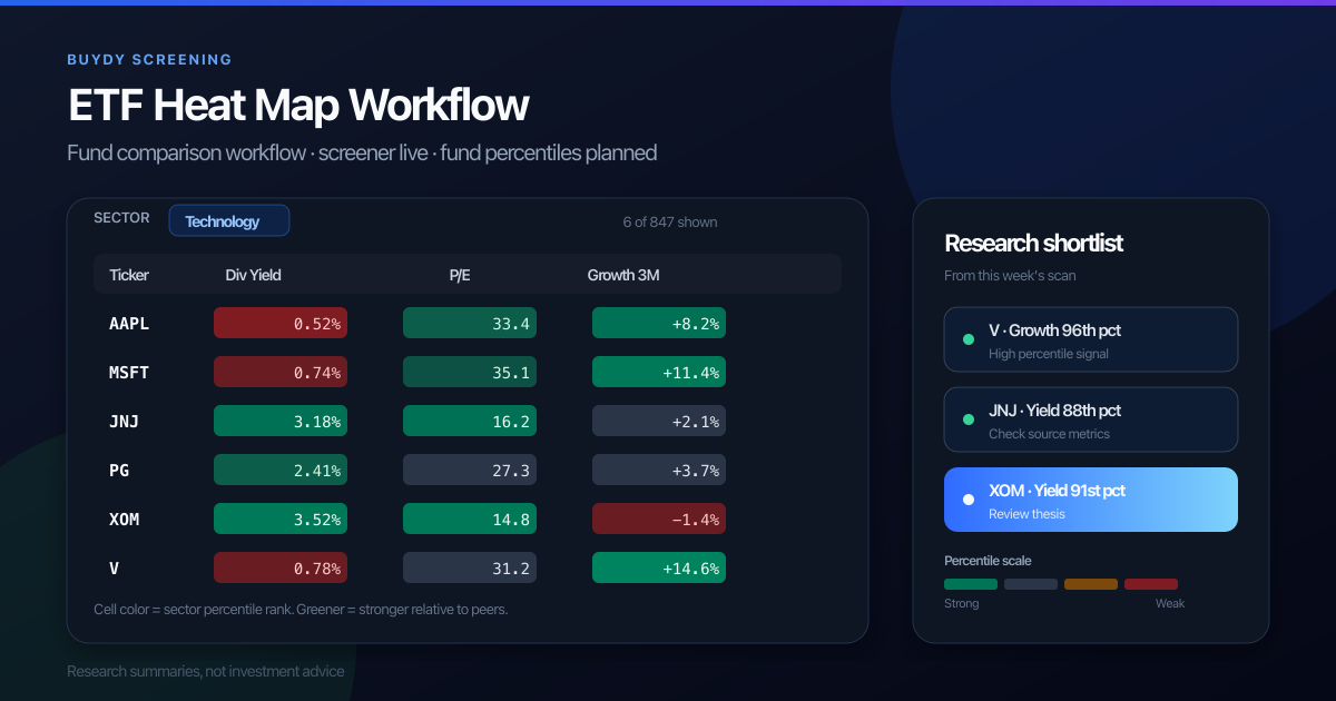
What is an ETF heat map? It is a comparison grid that ranks several funds on selected metrics at once so you can see who looks strong or weak across fees, liquidity, yield, exposure, and return windows. Used well, it answers one question: which ETFs deserve the next hour of research for your mandate? Used poorly, it becomes another colorful dashboard that rewards recent performance and hides structural differences.
This guide explains ETF heat maps, how they differ from stock heat maps and Finviz-style performance tiles, and how to run a repeatable workflow in Buydy with live ETF screener and ETF heat map tools.
What is an ETF heat map?
At a high level, an ETF heat map rows funds (VTI, SCHD, VXUS, and similar) and columns metrics (expense ratio, assets, yield, return windows, sector weights, holdings count, and more). Color or rank shows relative standing on each metric so you can spot outliers quickly.
That is different from a price chart or a single sortable screener table:
- A screener answers: who passes my filters right now?
- A heat map answers: among these candidates, who looks strong or weak across several dimensions at once?
Neither tool tells you what to buy. Both help you prioritize research.
What Buydy offers today
Buydy ships two live ETF research surfaces for US-listed funds:
| Screen |
Question it answers |
Status |
| ETF screener |
Who passes my filters right now? |
Live |
| ETF heat map |
How do shortlisted funds rank within label peer groups? |
Live |
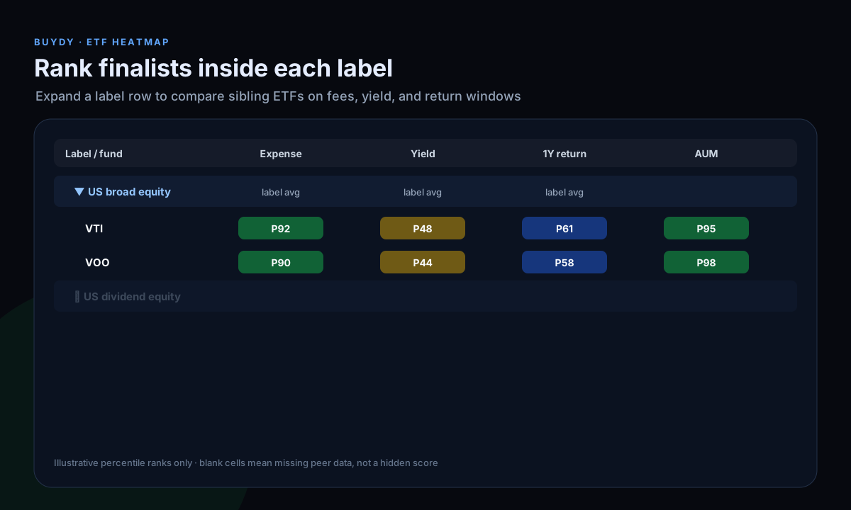
The ETF heat map groups funds by label peers. Expand a label row to compare sibling ETFs side by side. Cells show display percentiles within that peer set, with raw values available for verification. Blank cells mean missing or inapplicable data, not a hidden weak score.
Buydy's stock heat map remains separate: it compares large-cap equities by sector or industry percentiles. ETF symbols do not appear there. Pair both when you want fund-level ranks and underlying holdings research.
For the full side-by-side process, read how to compare two ETFs.
ETF heat map vs stock heat map
Stock and ETF heat maps share a visual language but answer different questions.
| Aspect |
Stock heat map |
ETF heat map |
| Unit of comparison |
Large-cap equities |
Funds (ETFs) |
| Typical metrics |
Dividend yield, P/E, leverage, EBITDA trend, price change |
Expense ratio, AUM, yield, holdings, sector/country weights, return windows |
| Peer group |
Sector or industry |
Label peer group (category / mandate) |
| Buydy status |
Live at market heat map |
Live at ETF heat map |
A common workflow: screen ETFs in the screener, rank finalists in the ETF heat map, then inspect top holdings with the stock heat map if single-name concentration matters.
For stock heat map colors, see how to read a stock heat map. For the live UI (Top Losers, filters, export), see how to use a stock heat map.
Finviz-style ETF maps vs a comparison workflow
Many investors first encounter ETF heat maps through Finviz-style performance tiles: fund squares sized by assets and colored by recent return. That format is excellent for a macro snapshot of what moved this week.
It is weaker for repeatable fund selection because:
- Performance color alone does not show fees, liquidity, or holdings overlap.
- Tile maps emphasize short-window returns, which can overweight recent regimes.
- Two funds in the same category can look similar on color while differing on index methodology, distribution policy, or tax efficiency.
Buydy does not ship Finviz-style performance tile maps. The live ETF heat map is a percentile comparison grid for fund research: fees, liquidity, yield, return windows, and related fields together within label peers.
A disciplined workflow layers mandate first, then structural metrics, then returns as context. For a dedicated Finviz comparison, read Finviz ETF heat map vs ETF screener or Finviz ETF heat map alternatives.
ETF sector heat maps and rotation
ETF sector heat maps (or sector performance grids) show which segments led or lagged over a window. They help with rotation context: when defensives lead, when cyclicals catch up, when rate-sensitive sectors diverge.
Use sector heat maps to frame questions, not as automatic trade signals:
- Which sectors are extended vs depressed relative to your time horizon?
- Does your portfolio already carry that exposure through broad index funds?
- Would a sector tilt add diversification or concentrate risk you already hold?
Sector color does not replace reading fund holdings. Two sector ETFs can have different factor bets, cap weights, and rebalance rules.
How to read colors, percentiles, and missing data
When a comparison surface uses percentiles, read them as peer context, not buy/sell instructions.
- Confirm the peer group. A yield percentile only makes sense relative to the fund set you chose (US dividend ETFs, global equity, investment-grade bond, etc.).
- Read raw values next. A strong percentile on a small absolute yield may still be immaterial for an income mandate.
- Treat blanks honestly. Missing expense data, thin history, or incompatible metrics should stay empty. A blank cell means insufficient or inapplicable data, not a hidden weak score.
In Buydy's ETF heat map, complete rows only hides funds missing a rank in any visible column. That keeps the grid readable; it does not mean those funds are worse.
Metrics that change ETF decisions
Beyond recent performance, compare:
- Expense ratio and share class (index methodology and fee tier matter).
- AUM and average volume (liquidity and spread risk).
- Distribution yield vs growth policy (income need vs reinvestment).
- Holdings count and top weights (diversification vs concentration).
- Sector and country exposure (two "global" ETFs can differ materially).
- Duration and credit quality (for bond ETFs).
- Tracking difference (implementation frictions vs the index).
"Best ETF" only means best fit for a stated goal: core equity, dividend income, bond ballast, sector tilt, or factor sleeve. For a full income mandate walkthrough, read how to select good income ETFs.
A repeatable weekly ETF heat map workflow
- Define mandate in writing (role in portfolio, time horizon, account type).
- Screen to a shortlist with the ETF screener.
- Rank finalists in the ETF heat map: expand the label row, read percentiles next to raw values.
- Inspect top holdings and overlap; use the stock heat map for underlying equity context when needed.
- Frame with global index monitoring.
- Record what changed since last week (fees stable, AUM trend, new top holdings, return window shift).
Run the same sequence each week so the process compounds instead of resetting. For screening-specific steps, see best ETF screener workflow.
Common ETF heat map mistakes
- Chasing color without reading fees, liquidity, or overlap.
- Comparing unlike funds (a bond ETF vs a tech sector ETF on one grid).
- Treating recent lag as value without checking exposure and index rules.
- Ignoring distribution tax and account placement (taxable vs tax-advantaged).
- Assuming diversification because the label says "global" or "balanced."
For screening-specific traps, see ETF screening mistakes to avoid.
FAQ
What is an ETF heat map?
An ETF heat map is a visual comparison grid that ranks or colors funds on selected metrics so you can compare several candidates at once. It supports prioritization, not automatic recommendations.
How is an ETF heat map different from a stock heat map?
A stock heat map compares companies on equity fundamentals and price metrics within sector or industry peers. An ETF heat map compares funds on cost, scale, exposure, distributions, and performance context. Buydy has live surfaces for both.
Does Buydy have a live ETF heat map today?
Yes. Buydy has a live ETF screener, a live ETF heat map with label peer percentiles for US-listed funds, and a live stock heat map for large-cap equities. Blank cells mean missing or inapplicable data.
What does Finviz show on its ETF map?
Finviz-style maps emphasize performance visualization and familiar tile layouts. They are useful snapshots. They are not a full substitute for fee, liquidity, holdings, and exposure comparison across a shortlist.
Is Buydy a Finviz ETF heat map?
No. Buydy does not offer Finviz-style performance tile maps. The ETF heat map is a percentile comparison grid paired with the ETF screener and stock heat map.
Are ETFs lower risk than individual stocks?
ETFs reduce single-company risk but still carry market, sector, rate, credit, concentration, and issuer risks. Lower single-stock risk does not mean low risk or guaranteed returns.
Why would a heat map cell be blank?
Blank usually means missing source data, an inapplicable metric for that fund type, or a calculation that declined under strict rules. It is coverage information, not a hidden score.
Is this investment advice?
No. These are research workflow notes. Portfolio decisions remain yours.
Next steps in Buydy
Research summaries, not investment advice.