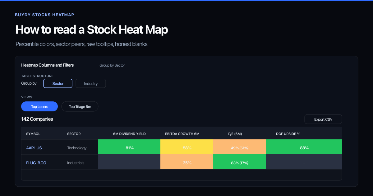
A stock heat map is a comparison grid that helps you rank many companies on selected metrics at once. Each cell should answer a narrow question: how does this metric compare to relevant peers? Used well, a heat map turns a wide universe into a short list worth deeper research. Used poorly, it becomes decoration: pretty colors that reward recent momentum and hide missing data.
This guide explains how to read stock heat map colors, percentile ranks, and blank cells. For the live UI (presets, filters, export), see how to use a stock heat map.
What is a stock heat map?
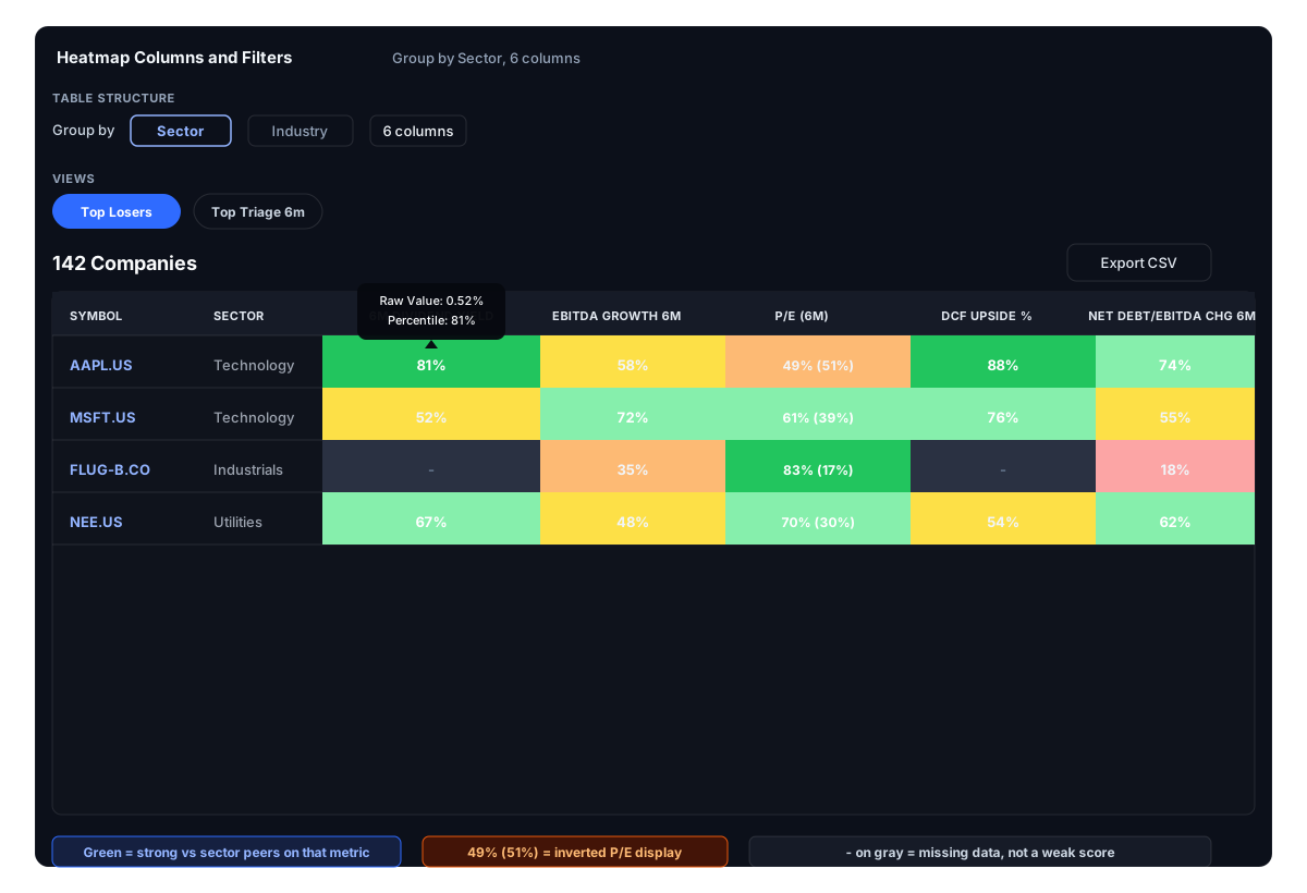
At a high level, a stock heat map rows companies and columns metrics (dividend yield, price to earnings, debt ratios, price change windows, and similar). Color or rank encodes relative standing within a peer group so you can spot outliers without reading every raw number in isolation.
That is different from a single sortable table or a price chart:
- A table sort answers: who is highest on one metric right now?
- A heat map answers: who looks strong or weak across several metrics at once, within the same peer context?
Neither format tells you what to buy. Both help you prioritize attention.
Product honesty: what Buydy's stock heat map covers
Buydy's live stock heat map compares large-cap equities with sector or industry percentile context. Raw metric values remain available in tooltips and company detail. ETF tickers are excluded from this view; fund research belongs on the ETF screener and, when you need equity context, on underlying holdings pulled from a fund shortlist.
Buydy pairs display percentiles with raw values so you can see both the number and its relative context. When source data is insufficient, cells stay blank. That is intentional: missing data is coverage information, not a silently assigned weak score.
Start with the peer group, not the ticker
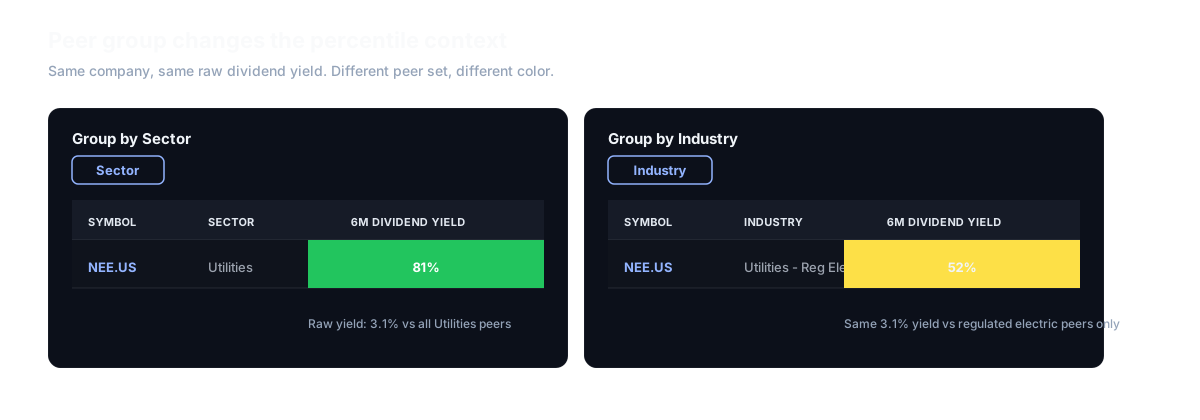
Before reading color, confirm which peer group applies. A dividend yield that looks high in isolation may be ordinary for Utilities and unusual for Technology. A low P/E may be common in Financials and rare in Software.
In Buydy, percentile context is computed within sector and industry groups:
| Peer group |
Best for |
| Sector |
Broader first-pass scans across a familiar segment |
| Industry |
Tighter comparison when you want closer operational peers |
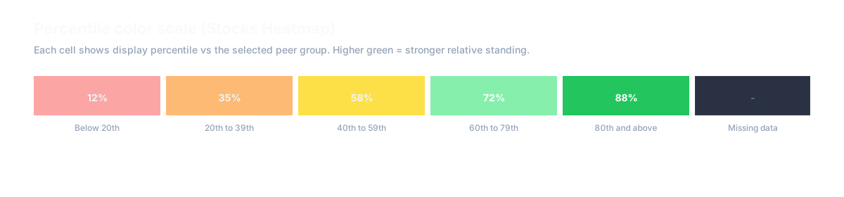
Greener cells generally mean stronger relative standing for that metric within the selected peer set. That is not an automatic buy signal. It is a prioritization cue: this name deserves a closer look on this dimension.
Switch peer groups when the question changes. Screening for dividend income within Utilities is a different task than comparing two semiconductor names on leverage.
Read percentiles before raw values
Raw metrics answer "what is the number?" Percentiles answer "how unusual is it for this group?"
Use this order every time:
- Scan for cells that stand out within a row or column.
- Check the raw value to confirm the signal is material, not a rounding artifact or a thin-data edge case.
- Open company detail to verify source data, calculation metadata, and freshness.
If a cell is blank, treat it as insufficient or excluded source data. Common causes include missing fundamentals, thin dividend history, negative or unusable EPS for P/E, or metrics that return null under Buydy's precision rules. Buydy does not invent fallback values when history or fundamentals are too thin.
Sector heat maps vs company heat maps
Sector performance grids show which segments led or lagged over a window. They help with rotation context. A company stock heat map ranks individual issuers vs peers on fundamentals. Use sector context to frame the week; use company percentiles to rank your watchlist.
Metric families worth comparing together
Buydy's stock heat map supports several metric families. Pick columns that match your mandate, then keep the set stable week to week so changes compound.
Income and dividends
- Current yield and dividend growth windows when history is sufficient; blank when it is not.
Valuation and balance sheet
- Price to earnings when EPS is positive and price history is sufficient.
- Debt to equity and net debt to EBITDA for capital-structure comparison.
- DCF upside when fundamentals support a strict model run; metadata explains declines.
Price performance
- Price change over 1W, 1M, 3M, and 1Y for momentum context alongside fundamentals.
Reading these together reduces single-metric mistakes. A strong yield percentile with rising leverage and weak growth percentiles tells a different story than yield alone.
Convert color into a shortlist
After scanning, write down three to five names that deserve the next hour of research. For each, note:
- Which metric drove attention
- Whether the percentile and raw value agree
- What would falsify the thesis (missed earnings, dividend cut risk, leverage trend, sector headwind)
This is where the stock heat map landing page connects to workflow: scan broadly, narrow deliberately, inspect evidence before any portfolio decision.
Common stock heat map mistakes
- Reading color without the peer group. A "strong" cell may be ordinary after you switch from sector to industry grouping.
- Treating blank cells as weak scores. Blanks mean missing or inapplicable data, not a hidden bottom rank.
- Chasing one hot column. Performance percentiles without yield, leverage, or valuation context often overfit recent regimes.
- Confusing heat maps with screeners. Buydy has a live ETF screener and a live stock heat map, not a separate stock screener route. Equity discovery on Buydy is heat map filters plus ranking, not a standalone equity screener product.
- Adding ETF tickers to the grid. ETFs are excluded from the stock heat map by design. Research funds on the ETF surfaces; research holdings on the equity grid when needed.
For tool-selection context, read stock heat map vs stock screener. For the live UI, see how to use a stock heat map. For fund workflows, see what is an ETF heat map.
Pair heat maps with indexes and ETF research
Heat maps compare; they do not replace macro framing or fund selection.
A practical weekly loop:
- Frame with global index monitoring.
- Rank equities on the stock heat map for your watchlist or a filtered universe.
- Screen ETFs separately when the question is fund mandate, fees, or exposure.
- Inspect holdings on the equity heat map when an ETF shortlist needs underlying concentration context.
For a full cadence template, see weekly market research workflow. Dividend-focused readers may also use dividend research workflows before returning to percentile ranks on the grid.
Make the review weekly
Daily noise fades; weekly cadence compounds. Return to the same universe, same metric set, and same review order. Note what changed in percentile ranks; that delta often matters more than a single static snapshot.
Each week, note which names moved on your key columns, whether blanks cleared or new gaps appeared, and which ideas survived company detail review.
FAQ
How do you read a heatmap?
Start with the peer group (sector or industry), then read each cell as a percentile rank within that group, not an absolute good or bad score. Confirm raw values in tooltips, treat blanks as missing data, and use the grid to prioritize which names deserve filing work next.
What is a stock heat map?
A stock heat map is a visual grid that compares companies on selected metrics at once, usually with color or rank showing relative standing within a peer group. It helps prioritize research; it does not replace due diligence.
What do the colors mean on Buydy's stock heat map?
Colors encode display percentiles vs sector or industry peers for each metric. Greener generally means stronger relative standing within that peer group. Always confirm the peer group and read raw values before acting.
Should I group by sector or industry?
Start with sector for broader scans. Switch to industry when you want tighter peers (for example, comparing semiconductor equipment names rather than all Technology). Change grouping when the research question changes.
Why is a heat map cell blank?
Blank means insufficient or excluded source data, not a hidden low score.
Can I put ETF tickers on the stock heat map?
No. The stock heat map covers large-cap equities only. Use the ETF screener for funds and the equity grid for underlying holdings when needed.
How is a stock heat map different from an ETF heat map?
Stock heat maps compare companies; ETF workflows compare funds. Buydy's equity percentile grid and ETF heat map are both live. See what is an ETF heat map.
Is this investment advice?
No. These are research workflow notes. Portfolio decisions remain yours.
Next steps in Buydy
Research summaries, not investment advice.